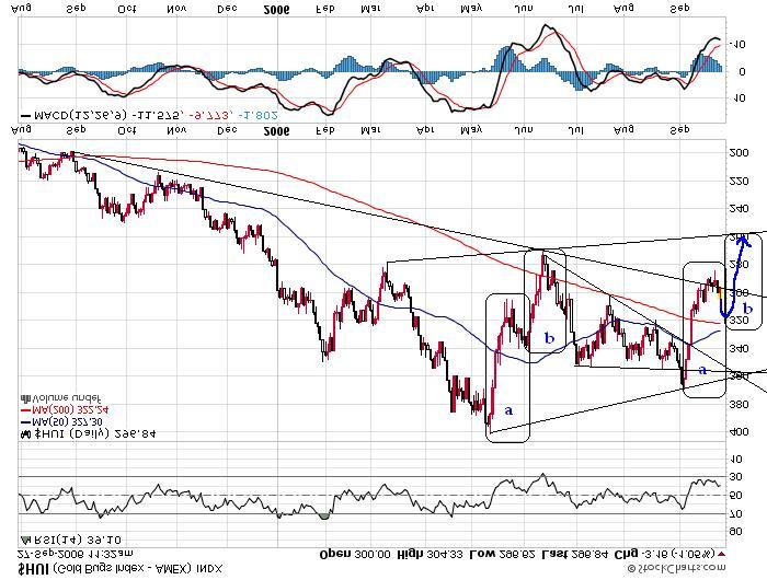
Comments: What is the above chart? Can you guess? I'll give you 3 guesses. It's the upside down chart of the HUI. If you guessed it right, then you may do well on an IQ test.
Sometimes when I feel really uncertain about a chart, I turn it upside down to see whether that perspective is more helpful, and frequently it is. I think two things became more readily apparent to me when looking at the HUI chart in this way:
1. First, the HUI has recently been quite badly oversold so that a bounce is quite understandable at this point. I think this is more obvious if we look at the recent sell off upside down, i.e., like as if it was a strong rally.
2. Second, there is a fairly interesting similarity between the way this sell off has been shaping up so far compared to the way that the sell off shaped up in June. If things play themsevles out similarly, we could see a bounce back to around 320 HUI (which move would correspond to the completion of the action in the "a" rectangle in June), followed by a reversal back down towards 260 HUI, in the same way that the action in rectangle "b" played itself out in June. It will be interesting to see whether the HUI plays itself out in this way this time around as well.
No comments:
Post a Comment